UnoCSS
UnoCSS 是一种原子化的 CSS 引擎,采用按需生成样式的方式。它没有固定的预设类库,而是通过扫描代码来动态产出所需的 CSS。
由于无需在打包中保留未使用的样式,因此能显著减少文件体积。同时支持多种预设与自定义规则,适合 Vue、React 等框架,开发体验灵活高效。
基础配置
安装依赖
pnpm add unocss@66.6.0在 Vite 中接入 UnoCSS
vite.config.ts
import { defineConfig } from 'vite';
import vue from '@vitejs/plugin-vue';
import path from 'path';
import UnoCSS from 'unocss/vite';

export default defineConfig({
    plugins: [
        vue(),
        UnoCSS(),
    ],
    resolve: {
        alias: {
            '@': path.resolve(__dirname, 'src'),
        }
    }
});创建 UnoCSS 配置文件
根目录新建:uno.config.ts
import { defineConfig, presetUno, presetAttributify, presetIcons } from 'unocss';

export default defineConfig({
  presets: [
    presetUno(),
    presetAttributify(),
    presetIcons(),
  ],
});这三个 preset 是最常用组合:
| preset | 作用 |
|---|---|
| presetUno | Tailwind 风格原子类 |
| presetAttributify | 属性写法,如 text="red-500" |
| presetIcons | 图标支持 |
引入 UnoCSS 样式入口
在 main.ts 中引入:
import { createApp } from 'vue';
import App from './App.vue';

import 'uno.css';

createApp(App).mount('#app');最简示例
<template>
  <div class="p-6">
    <h1 class="text-2xl font-bold text-blue-600 mb-4">
      UnoCSS with Vue3 + TypeScript
    </h1>

    <div class="flex gap-4">
      <div class="w-32 h-32 bg-red-400 rounded-lg"></div>
      <div class="w-32 h-32 bg-green-400 rounded-lg"></div>
      <div class="w-32 h-32 bg-blue-400 rounded-lg"></div>
    </div>
  </div>
</template>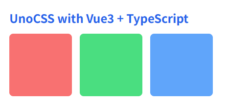
基础原子能力
布局与盒模型
<template>
  <!-- 页面整体容器 -->
  <div class="flex flex-col h-screen">

    <!-- 头部 -->
    <header class="flex items-center justify-between h-14 px-4 bg-gray-100">
      <span class="text-lg font-bold">Logo</span>
      <span class="text-sm text-gray-500">User</span>
    </header>

    <!-- 内容区 -->
    <main class="flex flex-row flex-1">
      <!-- 左侧菜单 -->
      <aside class="w-48 bg-gray-200 block">
        Menu
      </aside>

      <!-- 右侧内容 -->
      <section class="flex-1 grid place-items-center">
        <div class="inline-flex items-center justify-between w-64 h-20 bg-blue-500 text-white px-4">
          <span>Left</span>
          <span>Right</span>
        </div>
      </section>
    </main>

    <!-- 底部(可隐藏) -->
    <footer class="hidden h-10 bg-gray-300">
      Footer
    </footer>
  </div>
</template>| 类名 | 作用 | 等价 CSS |
|---|---|---|
flex | 设置为弹性布局容器 | display: flex; |
inline-flex | 设置为行内弹性布局容器 | display: inline-flex; |
grid | 设置为网格布局容器 | display: grid; |
block | 块级元素显示 | display: block; |
inline-block | 行内块级元素显示 | display: inline-block; |
hidden | 隐藏元素 | display: none; |
flex-row | 主轴方向为水平方向 | flex-direction: row; |
flex-col | 主轴方向为垂直方向 | flex-direction: column; |
flex-1 | 子元素占据剩余空间 | flex: 1 1 0%; |
items-center | 交叉轴方向居中对齐 | align-items: center; |
justify-between | 主轴两端对齐,中间自动分配 | justify-content: space-between; |
place-items-center | Grid 中水平 + 垂直居中 | place-items: center; |
h-screen | 高度为视口高度 | height: 100vh; |
h-14 | 固定高度(按 UnoCSS 标尺) | height: 3.5rem; |
h-10 | 固定高度(按 UnoCSS 标尺) | height: 2.5rem; |
h-20 | 固定高度(按 UnoCSS 标尺) | height: 5rem; |
w-48 | 固定宽度(按 UnoCSS 标尺) | width: 12rem; |
w-64 | 固定宽度(按 UnoCSS 标尺) | width: 16rem; |
px-4 | 左右内边距 | padding-left: 1rem; padding-right: 1rem; |
间距
<template>
  <!-- 外层容器:整体内边距 -->
  <div class="p-6 bg-gray-100">

    <!-- 标题:下外边距 -->
    <h2 class="text-xl font-bold mb-4">
      间距示例
    </h2>

    <!-- 卡片区域:左右内边距 + 上下内边距 -->
    <div class="px-4 py-3 bg-white rounded shadow">

      <!-- 列表容器:使用 gap 控制子项间距 -->
      <div class="flex flex-col gap-3">

        <!-- 单项:外边距控制项与项之间的额外距离 -->
        <div class="p-3 bg-blue-100">
          Item 1
        </div>

        <div class="p-3 bg-green-100 my-2">
          Item 2(带上下外边距)
        </div>

        <div class="p-3 bg-yellow-100 mx-4">
          Item 3(带左右外边距)
        </div>

      </div>
    </div>
  </div>
</template>| 类名 | 作用 | 等价 CSS | 说明 |
|---|---|---|---|
p-6 | 四个方向内边距 | padding: 1.5rem; | 容器整体留白 |
px-4 | 左右内边距 | padding-left: 1rem; padding-right: 1rem; | 常用于内容横向留白 |
py-3 | 上下内边距 | padding-top: 0.75rem; padding-bottom: 0.75rem; | 常用于块高度控制 |
p-3 | 四周内边距 | padding: 0.75rem; | 子项内容区留白 |
mb-4 | 下外边距 | margin-bottom: 1rem; | 标题与内容分隔 |
my-2 | 上下外边距 | margin-top: 0.5rem; margin-bottom: 0.5rem; | 拉开块之间的垂直距离 |
mx-4 | 左右外边距 | margin-left: 1rem; margin-right: 1rem; | 横向错位或缩进效果 |
gap-3 | 子元素之间的间距 | gap: 0.75rem; | 只对 flex / grid 容器生效 |
尺寸
<template>
  <div class="p-6 bg-gray-100">

    <!-- 固定尺寸 -->
    <div class="w-64 h-20 bg-blue-400 text-white flex items-center justify-center mb-4">
      固定宽高
    </div>

    <!-- 最小 / 最大宽度 -->
    <div class="min-w-48 max-w-96 bg-green-400 text-white p-4 mb-4">
      最小宽 12rem,最大宽 24rem
    </div>

    <!-- 最小 / 最大高度 -->
    <div class="min-h-24 max-h-48 bg-purple-400 text-white p-4 overflow-auto">
      <p>内容较少时保持最小高度</p>
      <p>内容较多时不超过最大高度</p>
      <p>多行内容示例</p>
      <p>多行内容示例</p>
      <p>多行内容示例</p>
    </div>

  </div>
</template>| 类名 | 作用 | 等价 CSS |
|---|---|---|
w-64 | 固定宽度 | width: 16rem; |
h-20 | 固定高度 | height: 5rem; |
min-w-48 | 最小宽度 | min-width: 12rem; |
max-w-96 | 最大宽度 | max-width: 24rem; |
min-h-24 | 最小高度 | min-height: 6rem; |
max-h-48 | 最大高度 | max-height: 12rem; |
p-6 | 内边距 | padding: 1.5rem; |
p-4 | 内边距 | padding: 1rem; |
mb-4 | 下外边距 | margin-bottom: 1rem; |
overflow-auto | 内容溢出自动滚动 | overflow: auto; |
字体
<template>
  <div class="p-6 bg-gray-100">

    <!-- 标题 -->
    <h1 class="text-2xl font-bold leading-tight tracking-wide mb-4">
      主标题:字体大小 + 粗细 + 行高 + 字距
    </h1>

    <!-- 副标题 -->
    <h2 class="text-lg font-medium leading-snug tracking-normal mb-2">
      副标题:中等粗细 + 舒适行高
    </h2>

    <!-- 正文 -->
    <p class="text-base leading-relaxed tracking-normal text-gray-700">
      这是正文文本示例,用来展示 UnoCSS 在字体大小、行高、字间距上的控制能力。
      适合后台系统、文档系统、内容展示页面等各种场景。
    </p>

  </div>
</template>| 类名 | 作用 | 等价 CSS |
|---|---|---|
text-2xl | 字体大小:大标题 | font-size: 1.5rem; |
text-lg | 字体大小:副标题 | font-size: 1.125rem; |
text-base | 字体大小:正文 | font-size: 1rem; |
font-bold | 字体加粗 | font-weight: 700; |
font-medium | 中等粗细 | font-weight: 500; |
leading-tight | 紧凑行高 | line-height: 1.25; |
leading-snug | 稍紧行高 | line-height: 1.375; |
leading-relaxed | 宽松行高 | line-height: 1.625; |
tracking-wide | 增大字间距 | letter-spacing: 0.025em; |
tracking-normal | 默认字间距 | letter-spacing: 0; |
mb-4 | 下外边距 | margin-bottom: 1rem; |
mb-2 | 下外边距 | margin-bottom: 0.5rem; |
p-6 | 内边距 | padding: 1.5rem; |
颜色
<template>
  <div class="p-6 bg-gray-100">

    <!-- 文本颜色 -->
    <p class="text-red-500 mb-4">
      这是红色文本(text-red-500)
    </p>

    <!-- 背景颜色 -->
    <div class="bg-blue-600 text-white p-4 mb-4 rounded">
      这是蓝色背景块(bg-blue-600)
    </div>

    <!-- 边框颜色 -->
    <div class="border border-gray-300 p-4 rounded bg-white">
      这是带灰色边框的容器(border-gray-300)
    </div>

  </div>
</template>| 类名 | 作用 | 等价 CSS |
|---|---|---|
text-red-500 | 设置文字颜色为红色(中等亮度) | color: #ef4444; |
bg-blue-600 | 设置背景颜色为深蓝色 | background-color: #2563eb; |
border-gray-300 | 设置边框颜色为浅灰色 | border-color: #d1d5db; |
border | 显示默认 1px 边框 | border-width: 1px; border-style: solid; |
text-white | 文字颜色为白色 | color: #ffffff; |
bg-gray-100 | 页面浅灰背景 | background-color: #f3f4f6; |
p-6 | 内边距 | padding: 1.5rem; |
p-4 | 内边距 | padding: 1rem; |
mb-4 | 下外边距 | margin-bottom: 1rem; |
rounded | 圆角 | border-radius: 0.25rem; |
颜色命名规则速记:
颜色名-数值数值越小越浅,越大越深,例如:gray-100(非常浅) →gray-300→gray-500→gray-700→gray-900
边框与阴影
<template>
  <div class="p-6 bg-gray-100">

    <!-- 基础边框 -->
    <div class="border border-gray-300 p-4 mb-4">
      基础边框(border + border-gray-300)
    </div>

    <!-- 圆角边框 -->
    <div class="border border-blue-400 rounded-lg p-4 mb-4">
      圆角边框(rounded-lg)
    </div>

    <!-- 阴影卡片 -->
    <div class="bg-white rounded-md shadow-md p-4 mb-4">
      中等阴影卡片(shadow-md)
    </div>

    <!-- 强阴影强调块 -->
    <div class="bg-white rounded-xl shadow-xl p-4">
      强阴影强调块(shadow-xl)
    </div>

  </div>
</template>| 类名 | 作用 | 等价 CSS |
|---|---|---|
border | 显示默认边框 | border-width: 1px; border-style: solid; |
border-gray-300 | 边框颜色为浅灰色 | border-color: #d1d5db; |
border-blue-400 | 边框颜色为蓝色 | border-color: #60a5fa; |
rounded-md | 中等圆角 | border-radius: 0.375rem; |
rounded-lg | 大圆角 | border-radius: 0.5rem; |
rounded-xl | 超大圆角 | border-radius: 0.75rem; |
shadow-sm | 小阴影 | box-shadow: 0 1px 2px rgba(0,0,0,0.05); |
shadow-md | 中等阴影 | box-shadow: 0 4px 6px rgba(0,0,0,0.1); |
shadow-lg | 大阴影 | box-shadow: 0 10px 15px rgba(0,0,0,0.15); |
shadow-xl | 强阴影 | box-shadow: 0 20px 25px rgba(0,0,0,0.2); |
bg-white | 白色背景 | background-color: #ffffff; |
p-6 | 内边距 | padding: 1.5rem; |
p-4 | 内边距 | padding: 1rem; |
mb-4 | 下外边距 | margin-bottom: 1rem; |
交互状态控制
Hover
<template>
  <div class="p-6 bg-gray-100 space-y-4">

    <!-- 背景色 Hover -->
    <button
      class="px-4 py-2 bg-blue-500 text-white rounded hover:bg-blue-600 transition"
    >
      Hover 改变背景色
    </button>

    <!-- 文字颜色 Hover -->
    <p
      class="text-gray-600 hover:text-red-500 transition cursor-pointer"
    >
      Hover 改变文字颜色
    </p>

    <!-- 阴影 Hover -->
    <div
      class="bg-white p-4 rounded shadow-sm hover:shadow-lg transition"
    >
      Hover 改变阴影强度
    </div>

  </div>
</template>| 类名 | 作用 | 等价 CSS |
|---|---|---|
hover:bg-blue-600 | 悬停时背景变为深蓝色 | :hover { background-color: #2563eb; } |
hover:text-red-500 | 悬停时文字变为红色 | :hover { color: #ef4444; } |
hover:shadow-lg | 悬停时显示大阴影 | :hover { box-shadow: 0 10px 15px rgba(0,0,0,0.15); } |
shadow-sm | 默认小阴影 | box-shadow: 0 1px 2px rgba(0,0,0,0.05); |
bg-blue-500 | 默认背景蓝色 | background-color: #3b82f6; |
text-gray-600 | 默认文字灰色 | color: #4b5563; |
rounded | 圆角 | border-radius: 0.25rem; |
transition | 启用过渡动画 | transition: all 0.15s ease-in-out; |
cursor-pointer | 鼠标悬停为手型 | cursor: pointer; |
px-4 | 左右内边距 | padding-left: 1rem; padding-right: 1rem; |
py-2 | 上下内边距 | padding-top: 0.5rem; padding-bottom: 0.5rem; |
p-4 | 内边距 | padding: 1rem; |
p-6 | 内边距 | padding: 1.5rem; |
space-y-4 | 子元素垂直间距 | > * + * { margin-top: 1rem; } |
Focus
<template>
  <div class="p-6 bg-gray-100 space-y-4">

    <!-- 输入框 Focus 示例 -->
    <input
      type="text"
      placeholder="获取焦点试试"
      class="w-64 px-3 py-2 border border-gray-300 rounded
             focus:outline-none focus:ring-2 focus:ring-blue-500"
    />

    <!-- 按钮 Focus 示例 -->
    <button
      class="px-4 py-2 bg-green-500 text-white rounded
             focus:outline-none focus:ring-2 focus:ring-green-400"
    >
      Focus 时显示 Ring
    </button>

  </div>
</template>| 类名 | 作用 | 等价 CSS |
|---|---|---|
focus:outline-none | 获取焦点时移除默认外轮廓 | :focus { outline: none; } |
focus:ring-2 | 获取焦点时显示 2px 的外发光环 | :focus { box-shadow: 0 0 0 2px var(--ring-color); } |
focus:ring-blue-500 | 焦点环颜色为蓝色 | --ring-color: #3b82f6; |
focus:ring-green-400 | 焦点环颜色为浅绿色 | --ring-color: #4ade80; |
border | 显示默认边框 | border-width: 1px; border-style: solid; |
border-gray-300 | 边框颜色为浅灰色 | border-color: #d1d5db; |
rounded | 圆角 | border-radius: 0.25rem; |
px-3 | 左右内边距 | padding-left: 0.75rem; padding-right: 0.75rem; |
py-2 | 上下内边距 | padding-top: 0.5rem; padding-bottom: 0.5rem; |
p-6 | 内边距 | padding: 1.5rem; |
space-y-4 | 子元素垂直间距 | > * + * { margin-top: 1rem; } |
w-64 | 固定宽度 | width: 16rem; |
Active
<template>
  <div class="p-6 bg-gray-100 space-y-4">

    <!-- 点击缩放效果 -->
    <button
      class="px-4 py-2 bg-blue-500 text-white rounded
             transition active:scale-95"
    >
      点击时缩小
    </button>

    <!-- 点击透明度变化 -->
    <button
      class="px-4 py-2 bg-red-500 text-white rounded
             transition active:opacity-70"
    >
      点击时变透明
    </button>

    <!-- 同时使用缩放 + 透明度 -->
    <button
      class="px-4 py-2 bg-green-500 text-white rounded
             transition active:scale-90 active:opacity-80"
    >
      点击综合效果
    </button>

  </div>
</template>| 类名 | 作用 | 等价 CSS |
|---|---|---|
active:scale-95 | 点击时缩放到 95% | :active { transform: scale(0.95); } |
active:scale-90 | 点击时缩放到 90% | :active { transform: scale(0.9); } |
active:opacity-70 | 点击时透明度为 70% | :active { opacity: 0.7; } |
active:opacity-80 | 点击时透明度为 80% | :active { opacity: 0.8; } |
transition | 启用平滑过渡动画 | transition: all 0.15s ease-in-out; |
px-4 | 左右内边距 | padding-left: 1rem; padding-right: 1rem; |
py-2 | 上下内边距 | padding-top: 0.5rem; padding-bottom: 0.5rem; |
p-6 | 内边距 | padding: 1.5rem; |
space-y-4 | 子元素垂直间距 | > * + * { margin-top: 1rem; } |
rounded | 圆角 | border-radius: 0.25rem; |
bg-blue-500 | 蓝色背景 | background-color: #3b82f6; |
bg-red-500 | 红色背景 | background-color: #ef4444; |
bg-green-500 | 绿色背景 | background-color: #22c55e; |
text-white | 白色文字 | color: #ffffff; |
在真实项目里,
active:scale-*+active:opacity-*几乎是所有按钮的标配手感反馈组合。
Disabled
<template>
  <div class="p-6 bg-gray-100 space-y-4">

    <!-- 禁用按钮:透明度 + 禁止光标 -->
    <button
      disabled
      class="px-4 py-2 bg-blue-500 text-white rounded
             disabled:opacity-50 disabled:cursor-not-allowed"
    >
      禁用按钮
    </button>

    <!-- 禁用输入框 -->
    <input
      disabled
      type="text"
      value="不可输入"
      class="w-64 px-3 py-2 border border-gray-300 rounded
             disabled:opacity-40 disabled:cursor-not-allowed"
    />

    <!-- 对比:可用按钮 -->
    <button
      class="px-4 py-2 bg-green-500 text-white rounded"
    >
      可用按钮
    </button>

  </div>
</template>| 类名 | 作用 | 等价 CSS |
|---|---|---|
disabled:opacity-50 | 禁用状态下透明度为 50% | :disabled { opacity: 0.5; } |
disabled:opacity-40 | 禁用状态下透明度为 40% | :disabled { opacity: 0.4; } |
disabled:cursor-not-allowed | 禁用状态下显示禁止操作光标 | :disabled { cursor: not-allowed; } |
disabled:* | 仅在元素处于 disabled 状态时生效 | :disabled { ... } |
bg-blue-500 | 蓝色背景 | background-color: #3b82f6; |
bg-green-500 | 绿色背景 | background-color: #22c55e; |
text-white | 白色文字 | color: #ffffff; |
border | 默认边框 | border-width: 1px; border-style: solid; |
border-gray-300 | 边框颜色为浅灰 | border-color: #d1d5db; |
rounded | 圆角 | border-radius: 0.25rem; |
px-4 | 左右内边距 | padding-left: 1rem; padding-right: 1rem; |
py-2 | 上下内边距 | padding-top: 0.5rem; padding-bottom: 0.5rem; |
px-3 | 左右内边距 | padding-left: 0.75rem; padding-right: 0.75rem; |
py-2 | 上下内边距 | padding-top: 0.5rem; padding-bottom: 0.5rem; |
p-6 | 内边距 | padding: 1.5rem; |
space-y-4 | 子元素垂直间距 | > * + * { margin-top: 1rem; } |
在实际项目中:
disabled:opacity-* + disabled:cursor-not-allowed基本是所有禁用态组件的标准组合,用来同时表达“不可用”和“不可操作”的视觉与交互语义。
过渡动画
<template>
  <div class="p-6 bg-gray-100 space-y-4">

    <!-- Hover + 过渡动画 -->
    <button
      class="px-4 py-2 bg-blue-500 text-white rounded
             transition duration-300 ease-in-out
             hover:bg-blue-600"
    >
      Hover 平滑变色
    </button>

    <!-- Active + 过渡动画 -->
    <button
      class="px-4 py-2 bg-green-500 text-white rounded
             transition duration-200 ease-in-out
             active:scale-95"
    >
      点击平滑缩放
    </button>

    <!-- 阴影过渡 -->
    <div
      class="bg-white p-4 rounded shadow-sm
             transition duration-300 ease-in-out
             hover:shadow-lg"
    >
      Hover 阴影平滑变化
    </div>

  </div>
</template>| 类名 | 作用 | 等价 CSS |
|---|---|---|
transition | 开启过渡效果(默认作用于常见属性) | transition-property: all; transition-duration: 150ms; |
duration-200 | 过渡时间 200ms | transition-duration: 200ms; |
duration-300 | 过渡时间 300ms | transition-duration: 300ms; |
ease-in-out | 过渡曲线:先慢后快再慢 | transition-timing-function: ease-in-out; |
hover:bg-blue-600 | 悬停时背景色变化 | :hover { background-color: #2563eb; } |
hover:shadow-lg | 悬停时阴影变大 | :hover { box-shadow: 0 10px 15px rgba(0,0,0,0.15); } |
active:scale-95 | 点击时缩放为 95% | :active { transform: scale(0.95); } |
shadow-sm | 默认小阴影 | box-shadow: 0 1px 2px rgba(0,0,0,0.05); |
bg-blue-500 | 默认蓝色背景 | background-color: #3b82f6; |
bg-green-500 | 默认绿色背景 | background-color: #22c55e; |
rounded | 圆角 | border-radius: 0.25rem; |
px-4 | 左右内边距 | padding-left: 1rem; padding-right: 1rem; |
py-2 | 上下内边距 | padding-top: 0.5rem; padding-bottom: 0.5rem; |
p-4 | 内边距 | padding: 1rem; |
p-6 | 内边距 | padding: 1.5rem; |
space-y-4 | 子元素垂直间距 | > * + * { margin-top: 1rem; } |
在实际项目里几乎所有“可交互组件”都会带上这三件套:
transition + duration-* + ease-in-out
它们决定了 UI 的“手感好不好”,比颜色本身还重要。
响应式系统
断点前缀
<template>
  <div class="p-6 bg-gray-100">

    <!-- 响应式容器 -->
    <div
      class="
        bg-blue-400 text-white p-4 rounded
        sm:bg-green-400
        md:bg-yellow-400
        lg:bg-red-400
        xl:bg-purple-500
      "
    >
      根据屏幕尺寸改变背景颜色:
      <ul class="mt-2 list-disc pl-4">
        <li>默认:蓝色</li>
        <li>sm:绿色</li>
        <li>md:黄色</li>
        <li>lg:红色</li>
        <li>xl:紫色</li>
      </ul>
    </div>

    <!-- 响应式布局 -->
    <div
      class="
        mt-6 flex flex-col gap-4
        md:flex-row
      "
    >
      <div class="flex-1 bg-white p-4 rounded shadow">
        左侧内容
      </div>
      <div class="flex-1 bg-white p-4 rounded shadow">
        右侧内容
      </div>
    </div>

  </div>
</template>| 类名 | 作用 | 等价 CSS |
|---|---|---|
sm:* | 屏幕宽度 ≥ sm 时生效 | @media (min-width: 640px) { ... } |
md:* | 屏幕宽度 ≥ md 时生效 | @media (min-width: 768px) { ... } |
lg:* | 屏幕宽度 ≥ lg 时生效 | @media (min-width: 1024px) { ... } |
xl:* | 屏幕宽度 ≥ xl 时生效 | @media (min-width: 1280px) { ... } |
sm:bg-green-400 | ≥640px 时背景变绿 | background-color: #4ade80; |
md:bg-yellow-400 | ≥768px 时背景变黄 | background-color: #facc15; |
lg:bg-red-400 | ≥1024px 时背景变红 | background-color: #f87171; |
xl:bg-purple-500 | ≥1280px 时背景变紫 | background-color: #a855f7; |
flex-col | 默认纵向排列 | flex-direction: column; |
md:flex-row | ≥768px 时改为横向排列 | @media (min-width: 768px) { flex-direction: row; } |
gap-4 | 子元素间距 | gap: 1rem; |
flex-1 | 子元素平均占满空间 | flex: 1 1 0%; |
p-4 | 内边距 | padding: 1rem; |
p-6 | 内边距 | padding: 1.5rem; |
mt-6 | 上外边距 | margin-top: 1.5rem; |
rounded | 圆角 | border-radius: 0.25rem; |
shadow | 默认阴影 | box-shadow: 0 1px 3px rgba(0,0,0,0.1); |
响应式核心记忆法: 小屏写默认,大屏用前缀覆盖 也就是:不写前缀 = 手机端样式,
sm/md/lg/xl逐级增强。
常见场景
<template>
  <div class="p-6 bg-gray-100 space-y-6">

    <!-- 1. 移动端列布局 / PC 端行布局 -->
    <div
      class="
        flex flex-col gap-4
        md:flex-row
      "
    >
      <div class="flex-1 bg-blue-400 text-white p-4 rounded">
        区块 A
      </div>
      <div class="flex-1 bg-green-400 text-white p-4 rounded">
        区块 B
      </div>
    </div>

    <!-- 2. 小屏隐藏 / 大屏显示 -->
    <div class="bg-white p-4 rounded shadow">
      <p class="text-gray-700">
        这个文本在所有屏幕可见
      </p>
      <p class="hidden md:block text-blue-600 mt-2">
        这个文本仅在中等及以上屏幕显示(md+)
      </p>
    </div>

    <!-- 3. 不同屏幕字号适配 -->
    <div class="bg-purple-500 text-white p-4 rounded">
      <p
        class="
          text-sm
          sm:text-base
          md:text-lg
          lg:text-xl
          xl:text-2xl
        "
      >
        根据屏幕尺寸自动变化字号的文本
      </p>
    </div>

  </div>
</template>| 类名 | 作用 | 等价 CSS |
|---|---|---|
flex-col | 默认纵向布局(移动端) | flex-direction: column; |
md:flex-row | ≥768px 时切换为横向布局 | @media (min-width: 768px) { flex-direction: row; } |
hidden | 隐藏元素 | display: none; |
md:block | ≥768px 时显示为块级元素 | @media (min-width: 768px) { display: block; } |
text-sm | 小字号 | font-size: 0.875rem; |
sm:text-base | ≥640px 时标准字号 | font-size: 1rem; |
md:text-lg | ≥768px 时较大字号 | font-size: 1.125rem; |
lg:text-xl | ≥1024px 时大标题字号 | font-size: 1.25rem; |
xl:text-2xl | ≥1280px 时超大字号 | font-size: 1.5rem; |
gap-4 | 子元素间距 | gap: 1rem; |
flex-1 | 子元素平分容器空间 | flex: 1 1 0%; |
p-6 | 容器内边距 | padding: 1.5rem; |
p-4 | 内容内边距 | padding: 1rem; |
mt-2 | 上外边距 | margin-top: 0.5rem; |
rounded | 圆角 | border-radius: 0.25rem; |
shadow | 默认阴影 | box-shadow: 0 1px 3px rgba(0,0,0,0.1); |
这三种是后台系统和管理端页面中使用频率最高的响应式组合场景,基本覆盖了 90% 的适配需求。
Attributify 属性化模式
基础写法
<template>
  <div
    p="6"
    bg="gray-100"
    class="space-y-4"
  >
    <!-- 基础间距 -->
    <div
      p="4"
      m="2"
      bg="white"
      rounded
      shadow
    >
      基础 p / m 示例
    </div>

    <!-- 文字样式 -->
    <div
      p="4"
      text="red-500 xl"
      bg="gray-50"
      rounded
    >
      红色 + 大字号文本
    </div>

    <!-- 混合使用响应式 -->
    <div
      p="2 md:6"
      text="blue-600 sm lg"
      bg="blue-50"
      rounded
    >
      响应式 Attributify 示例
    </div>
  </div>
</template>| 属性写法 | 作用 | 等价 Tailwind 类 | 等价 CSS |
|---|---|---|---|
p="4" | 内边距 1rem | p-4 | padding: 1rem; |
m="2" | 外边距 0.5rem | m-2 | margin: 0.5rem; |
text="red-500" | 文字颜色红色 | text-red-500 | color: #ef4444; |
text="xl" | 大字号文本 | text-xl | font-size: 1.25rem; |
text="red-500 xl" | 文字颜色 + 字号组合 | text-red-500 text-xl | 颜色 + 字号 |
bg="gray-100" | 背景浅灰 | bg-gray-100 | background-color: #f3f4f6; |
p="2 md:6" | 小屏 padding 0.5rem,大屏 1.5rem | p-2 md:p-6 | 媒体查询控制 padding |
text="blue-600 sm lg" | 响应式字号 | text-blue-600 sm:text-sm lg:text-lg | 不同断点不同字号 |
rounded | 圆角 | rounded | border-radius: 0.25rem; |
shadow | 阴影 | shadow | box-shadow: 0 1px 3px rgba(0,0,0,0.1); |
Attributify 模式本质就是: 把原本写在
class里的工具类,拆分成语义化属性, 更适合 Vue / JSX 场景,结构更清晰,特别适合复杂组件和表单布局。
布局属性化
<template>
  <div p="6" bg="gray-100" class="space-y-6">

    <!-- Flex 布局属性化 -->
    <div
      flex="~ col"
      gap="4"
      p="4"
      bg="white"
      rounded
      shadow
    >
      <div class="bg-blue-100 p-2 rounded">Item 1</div>
      <div class="bg-blue-100 p-2 rounded">Item 2</div>
      <div class="bg-blue-100 p-2 rounded">Item 3</div>
    </div>

    <!-- Grid 布局属性化 -->
    <div
      grid="~ cols-3 gap-4"
      p="4"
      bg="white"
      rounded
      shadow
    >
      <div class="bg-green-100 p-2 rounded">A</div>
      <div class="bg-green-100 p-2 rounded">B</div>
      <div class="bg-green-100 p-2 rounded">C</div>
      <div class="bg-green-100 p-2 rounded">D</div>
      <div class="bg-green-100 p-2 rounded">E</div>
      <div class="bg-green-100 p-2 rounded">F</div>
    </div>

  </div>
</template>| 属性写法 | 作用 | 等价类名写法 | 等价 CSS |
|---|---|---|---|
flex="~" | 启用 flex 布局 | flex | display: flex; |
flex="~ col" | 纵向 flex 容器 | flex flex-col | display: flex; flex-direction: column; |
flex="~ row" | 横向 flex 容器(默认) | flex flex-row | display: flex; flex-direction: row; |
grid="~" | 启用 grid 布局 | grid | display: grid; |
grid="~ cols-3" | 3 列网格 | grid-cols-3 | grid-template-columns: repeat(3, 1fr); |
grid="~ gap-4" | 网格间距 | gap-4 | gap: 1rem; |
grid="~ cols-3 gap-4" | 3 列 + 间距组合 | grid grid-cols-3 gap-4 | 同上组合 |
gap="4" | 子元素间距 | gap-4 | gap: 1rem; |
p="4" | 内边距 | p-4 | padding: 1rem; |
bg="white" | 白色背景 | bg-white | background-color: #ffffff; |
rounded | 圆角 | rounded | border-radius: 0.25rem; |
shadow | 阴影 | shadow | box-shadow: 0 1px 3px rgba(0,0,0,0.1); |
这套
flex="~"/grid="~"写法是 UnoCSS Attributify 最有“工程价值”的能力之一: 布局语义极其清晰,HTML 结构可读性比 class 堆叠高一个数量级,非常适合 Vue3 + 组件化项目。
组合使用
<template>
  <!-- 整个页面容器 -->
  <div
    flex="~ col"
    h="screen"
    bg="gray-100"
  >
    <!-- 顶部栏 -->
    <header
      flex="~"
      items="center"
      justify="between"
      p="4"
      bg="white"
      shadow
    >
      <span text="lg bold">后台管理系统</span>
      <span text="sm gray-500">Admin</span>
    </header>

    <!-- 主体区域 -->
    <main
      flex="~"
      flex-1
    >
      <!-- 侧边栏 -->
      <aside
        w="56"
        bg="gray-200"
        p="4"
        flex="~ col"
        gap="2"
      >
        <div p="2" bg="white" rounded shadow>菜单 1</div>
        <div p="2" bg="white" rounded shadow>菜单 2</div>
        <div p="2" bg="white" rounded shadow>菜单 3</div>
      </aside>

      <!-- 内容区 -->
      <section
        flex="~ col"
        flex-1
        p="6"
        gap="4"
      >
        <!-- 表单区域 -->
        <div
          grid="~ cols-2 gap-4"
          bg="white"
          p="4"
          rounded
          shadow
        >
          <input
            p="2"
            border
            rounded
            placeholder="用户名"
          />
          <input
            p="2"
            border
            rounded
            placeholder="邮箱"
          />
          <input
            p="2"
            border
            rounded
            placeholder="手机号"
          />
          <input
            p="2"
            border
            rounded
            placeholder="角色"
          />
        </div>

        <!-- 表格区域 -->
        <div
          flex="~ col"
          bg="white"
          p="4"
          rounded
          shadow
        >
          <div
            flex="~"
            justify="between"
            mb="2"
          >
            <span text="md bold">用户列表</span>
            <button
              px="3"
              py="1"
              bg="blue-500"
              text="white"
              rounded
              hover:bg="blue-600"
              active:scale-95
              transition
            >
              新增
            </button>
          </div>
          <div text="sm gray-500">
            这里是表格内容区域
          </div>
        </div>
      </section>
    </main>
  </div>
</template>| 用法 | 说明 | 优势 |
|---|---|---|
flex="~ col" + grid="~ cols-*" | Flex + Grid 混合布局 | 复杂后台布局最优组合 |
p="*", m="*", gap="*" | 间距统一用属性控制 | 结构比 class 更直观 |
bg="*", text="*" | 颜色与文字语义化 | 样式语义更强 |
rounded, shadow, border | 视觉层级快速搭建 | 页面立体感明显 |
| Hover / Active / Transition | 按钮交互反馈 | 产品质感明显提升 |
响应式前缀 (sm:, md:) | 多端适配 | 后台系统必备 |
| Attributify + class 混用 | 复杂场景灵活 | 不牺牲 UnoCSS 完整能力 |
这种“组合使用”模式,正是 UnoCSS 在 Vue3 + Vite 项目里最适合做: 后台管理、表单密集型系统、配置页面、仪表盘页面。 模板会非常干净,布局结构一眼可读,维护成本比纯 class 堆叠低很多。
图标系统(preset-icons)
vite.config.ts
import { defineConfig } from 'vite';
import vue from '@vitejs/plugin-vue';
import path from 'path';
import UnoCSS from 'unocss/vite';
import Icons from 'unplugin-icons/vite'
import IconsResolver from 'unplugin-icons/resolver'
import Components from 'unplugin-vue-components/vite'

export default defineConfig({
    plugins: [
        vue(),
        UnoCSS(),
        Components({
            resolvers: [
                IconsResolver({ prefix: 'Icon' }) // 自动识别 IconXxx
            ],
        }),
        Icons({
            autoInstall: true, // 缺失图标自动安装
        }),
    ],
    resolve: {
        alias: {
            '@': path.resolve(__dirname, 'src'),
        }
    }
});Iconify 图标
<template>
  <div class="p-6 bg-gray-100 space-y-6">

    <!-- 常用图标示例 -->
    <div class="flex items-center gap-4">
      <i-mdi-home text="2xl blue-500"></i-mdi-home>
      <span text="lg">首页</span>
    </div>

    <div class="flex items-center gap-4">
      <i-mdi-account text="2xl green-500"></i-mdi-account>
      <span text="lg">账号</span>
    </div>

    <div class="flex items-center gap-4">
      <i-carbon-search text="2xl red-500"></i-carbon-search>
      <span text="lg">搜索</span>
    </div>

    <!-- 响应式图标大小 -->
    <div class="flex items-center gap-4 mt-4">
      <i-mdi-home text="xl sm:2xl md:3xl"></i-mdi-home>
      <span text="sm md:base lg:lg">响应式图标</span>
    </div>

  </div>
</template>| 类名 / 标签 | 作用 | 等价 CSS / 描述 |
|---|---|---|
i-mdi-home | 引入 Material Design Home 图标 | 使用 Iconify 组件,自动加载图标 |
i-mdi-account | 引入 Material Design 账号图标 | 同上 |
i-carbon-search | 引入 Carbon Design 搜索图标 | 同上 |
text="2xl" | 设置图标大小为 2xl | font-size: 1.5rem; |
text="xl sm:2xl md:3xl" | 响应式字号 | 小屏 xl,中屏 2xl,大屏 3xl |
text="blue-500" | 图标颜色蓝色 | color: #3b82f6; |
text="green-500" | 图标颜色绿色 | color: #22c55e; |
text="red-500" | 图标颜色红色 | color: #ef4444; |
flex items-center gap-4 | 图标 + 文本排列 | display: flex; align-items: center; gap: 1rem; |
mt-4 | 上外边距 | margin-top: 1rem; |
说明: UnoCSS
preset-icons基于 Iconify,支持上千图标集(Material Design, Carbon, FontAwesome, RemixIcon 等), 可直接在模板中通过i-图标名使用,并可结合text-*控制大小和颜色,非常适合后台系统和工具面板。
图标控制能力
<template>
  <div class="p-6 bg-gray-100 space-y-6">

    <!-- 1. 颜色控制 -->
    <div class="flex items-center gap-4">
      <i-mdi-home text="2xl blue-500"></i-mdi-home>
      <i-mdi-home text="2xl red-500"></i-mdi-home>
      <span text="lg">不同颜色图标</span>
    </div>

    <!-- 2. 大小控制 -->
    <div class="flex items-center gap-4 mt-4">
      <i-mdi-account text="xl"></i-mdi-account>
      <i-mdi-account text="2xl"></i-mdi-account>
      <i-mdi-account text="3xl"></i-mdi-account>
      <span text="lg">不同大小图标</span>
    </div>

    <!-- 3. 旋转与动画 -->
    <div class="flex items-center gap-4 mt-4">
      <i-carbon-search text="2xl" rotate="45"></i-carbon-search>
      <i-carbon-search text="2xl" spin></i-carbon-search>
      <span text="lg">旋转与旋转动画</span>
    </div>

    <!-- 4. 与文字自然对齐 -->
    <div class="flex items-center gap-2 mt-4">
      <i-mdi-home text="xl"></i-mdi-home>
      <span text="base">文字垂直居中对齐</span>
    </div>

  </div>
</template>| 功能 | 属性 / 类名 | 作用 | 等价 CSS / 描述 |
|---|---|---|---|
| 颜色控制 | text="red-500" | 改变图标颜色 | color: #ef4444; |
| 颜色控制 | text="blue-500" | 改变图标颜色 | color: #3b82f6; |
| 大小控制 | text="xl" / 2xl / 3xl | 控制图标尺寸 | font-size: 1.25rem / 1.5rem / 1.875rem; |
| 旋转 | rotate="45" | 旋转图标 45° | transform: rotate(45deg); |
| 旋转动画 | spin | 图标持续旋转 | animation: spin 1s linear infinite; |
| 对齐 | flex items-center | 与文字自然垂直居中 | display: flex; align-items: center; |
| 间距 | gap-2 / gap-4 | 图标与文字或图标间距 | gap: 0.5rem / 1rem; |
说明: Iconify 图标在 UnoCSS 中不仅可随意控制颜色和大小,还可以旋转、添加动画、与文字自然对齐,非常适合后台操作按钮、状态指示器、加载图标等场景。
Shortcuts(语义化类名)
<template>
  <div page-container>

    <!-- 按钮示例 -->
    <button btn-primary>主操作按钮</button>
    <button btn-secondary>次操作按钮</button>

    <!-- 卡片示例 -->
    <div card>
      <h3 text="lg bold mb-2">卡片标题</h3>
      <p text="sm gray-600">卡片内容示例</p>
      <div class="mt-4">
        <button btn-primary>确认</button>
        <button btn-secondary>取消</button>
      </div>
    </div>

    <!-- 表单项示例 -->
    <div form-item>
      <label text="sm bold mb-1 block">用户名</label>
      <input type="text" placeholder="请输入用户名" />
    </div>

  </div>
</template>| Shortcut 名称 | 原子类组合 | 作用 | 优势 |
|---|---|---|---|
btn-primary | px-4 py-2 bg-blue-500 text-white rounded shadow hover:bg-blue-600 active:scale-95 transition | 主要操作按钮 | 样式统一、减少模板重复 |
btn-secondary | px-4 py-2 bg-gray-200 text-gray-700 rounded shadow hover:bg-gray-300 active:scale-95 transition | 次要操作按钮 | 统一次级按钮视觉 |
card | p-4 bg-white rounded shadow | 卡片容器 | 复用性高,快速布局 |
page-container | p-6 bg-gray-100 min-h-screen | 页面整体容器 | 保持整体布局统一 |
form-item | mb-4 flex flex-col | 表单行布局 | 简化表单模板结构 |
使用 Shortcuts 的核心价值:
- 统一样式规范:项目中相同类型组件外观一致;
- 降低模板复杂度:避免大量原子类堆叠,HTML 更清晰;
- 强化项目结构感:业务语义明确,维护和扩展成本低。
实际项目中,按钮、卡片、表单、页面容器通常都是最常用的 Shortcut 组合,可以根据业务进一步扩展,如
table-row,modal-container,input-group等。
Rules(自定义原子规则)
// uno.config.ts 示例
import { defineConfig, presetUno, presetIcons } from 'unocss'

export default defineConfig({
  presets: [presetUno(), presetIcons()],
  rules: [
    // 安全区顶部
    ['safe-top', { paddingTop: 'env(safe-area-inset-top)' }],
    // 导航栏高度
    ['nav-height', { height: '56px' }],
    // 内容区撑满剩余空间
    ['content-full', { flex: '1 1 auto' }],
    // 顶部偏移(可带数字)
    [/^header-offset-(\d+)$/, ([, d]) => ({ marginTop: `${d}px` })],
  ],
})<template>
<div flex="~ col h-screen">
<header nav-height bg="blue-500 text-white flex items-center justify-center">
顶部导航栏
</header>
<main content-full bg="gray-100 p-6 safe-top">
<p>内容区自动撑满剩余空间,并适配刘海屏安全区</p>
<div header-offset-20 bg="white p-4 rounded shadow mt-2">
偏移 20px 的区域
</div>
</main>
</div>
</template>| 语义类 | 作用 | 等价 CSS |
|---|---|---|
safe-top | 适配刘海屏安全区顶部 | padding-top: env(safe-area-inset-top); |
nav-height | 统一导航栏高度 | height: 56px; |
content-full | 主内容区域撑满剩余空间 | flex: 1 1 auto; |
header-offset-20 | 顶部偏移 20px | margin-top: 20px; |
/^header-offset-(\d+)$/ | 动态偏移,可自定义 px | margin-top: ${d}px; |
使用 Rules 的价值:
- 非标准尺寸:快速应对设计稿里没有现成 Tailwind 类的尺寸;
- 业务语义化:将业务含义直接映射到类名,更直观;
- 特殊布局:解决 flex / grid / safe-area / sticky 等场景下的边界问题。
Tips:动态规则(如
header-offset-*)是 UnoCSS 最强大的功能之一,可以根据数字自动生成 CSS,非常适合响应业务需求。
主题系统(Design Token)
主题系统(Design Token)
// uno.config.ts 主题配置示例
import { defineConfig, presetUno } from 'unocss'

export default defineConfig({
  presets: [presetUno()],
  theme: {
    colors: {
      primary: '#3b82f6',    // 主色
      success: '#22c55e',    // 成功色
      warning: '#f59e0b',    // 警告色
      error: '#ef4444',      // 错误色
      background: '#f3f4f6', // 背景色
      text: '#111827',       // 默认文字色
    },
  },
})<template>
<div p="6" bg="background" class="space-y-4">
<!-- 主色按钮 -->
<button
px="4" py="2" rounded text="white"
bg="primary"
hover:bg="primary/80"
>
主操作
</button>
<!-- 成功提示 -->
<div p="4" rounded bg="success/20" text="success">
操作成功
</div>
<!-- 警告提示 -->
<div p="4" rounded bg="warning/20" text="warning">
警告信息
</div>
<!-- 错误提示 -->
<div p="4" rounded bg="error/20" text="error">
错误信息
</div>
</div>
</template>| Token 名称 | 作用 | 等价 CSS / 说明 |
|---|---|---|
primary | 主色,用于品牌色 / 主要按钮 | background-color: #3b82f6; color: #ffffff; |
success | 成功色,用于提示 / 状态 | color: #22c55e; background-color: #d1fae5; |
warning | 警告色,用于提示 / 警告 | color: #f59e0b; background-color: #fef3c7; |
error | 错误色,用于提示 / 错误 | color: #ef4444; background-color: #fee2e2; |
background | 页面背景色 | background-color: #f3f4f6; |
text | 默认文字色 | color: #111827; |
/20 | 半透明背景(20% 不透明度) | background-color: rgba(..., 0.2) |
hover:bg="primary/80" | 鼠标悬停改变透明度 | background-color: rgba(59,130,246,0.8) |
使用主题系统的好处:
- 统一颜色体系:整个项目风格一致;
- 可维护:修改 token 自动生效全局;
- 适配暗黑模式 / 多主题:只需切换 token 值,无需修改每个组件。
尺寸体系
// uno.config.ts 尺寸体系示例
import { defineConfig, presetUno } from 'unocss'

export default defineConfig({
  presets: [presetUno()],
  theme: {
    spacing: {
      xs: '4px',
      sm: '8px',
      md: '16px',
      lg: '24px',
      xl: '32px',
      '2xl': '48px',
    },
    borderRadius: {
      none: '0px',
      sm: '4px',
      DEFAULT: '8px',
      lg: '12px',
      full: '9999px',
    },
    fontSize: {
      xs: '0.75rem',   // 12px
      sm: '0.875rem',  // 14px
      base: '1rem',    // 16px
      lg: '1.125rem',  // 18px
      xl: '1.25rem',   // 20px
      '2xl': '1.5rem', // 24px
      '3xl': '1.875rem', // 30px
    },
  },
})<template>
<div p="md" bg="background" class="space-y-lg">
<!-- 间距规范 -->
<div p="sm" bg="white" rounded shadow>
内边距小 (sm)
</div>
<div p="md" bg="white" rounded shadow>
内边距中 (md)
</div>
<div p="lg" bg="white" rounded shadow>
内边距大 (lg)
</div>
<!-- 圆角规范 -->
<div p="4" bg="primary" text="white" rounded="sm">圆角 sm</div>
<div p="4" bg="primary" text="white" rounded="DEFAULT">圆角默认</div>
<div p="4" bg="primary" text="white" rounded="lg">圆角 lg</div>
<div p="4" bg="primary" text="white" rounded="full">圆形</div>
<!-- 字号规范 -->
<p text="xs">文字 xs</p>
<p text="sm">文字 sm</p>
<p text="base">文字 base</p>
<p text="lg">文字 lg</p>
<p text="xl">文字 xl</p>
<p text="2xl">文字 2xl</p>
<p text="3xl">文字 3xl</p>
</div>
</template>| 体系 | 类名 / 属性 | 作用 | 等价 CSS |
|---|---|---|---|
| 间距 | p-sm/md/lg | 内边距规范 | padding: 8px/16px/24px; |
| 间距 | m-sm/md/lg | 外边距规范 | margin: 8px/16px/24px; |
| 圆角 | rounded-sm/DEFAULT/lg/full | 边角圆润度 | border-radius: 4px/8px/12px/9999px; |
| 字号 | text-xs/sm/base/lg/xl/2xl/3xl | 字号规范 | font-size: 0.75rem~1.875rem; |
| 间距单位 | xs/sm/md/lg/xl/2xl | 统一间距单位 | padding / margin 统一规范 |
| 圆角单位 | sm/DEFAULT/lg/full | 统一圆角 | border-radius 统一规范 |
| 字号单位 | xs/sm/base/lg/xl/2xl/3xl | 统一字体大小 | font-size 统一规范 |
使用尺寸体系的价值:
- 统一间距、圆角、字号:保持整个项目风格一致;
- 设计稿对齐:方便与设计稿 px / rem 尺寸映射;
- 可扩展性强:新增尺寸只需修改 token,无需修改每个组件。
字体体系
// uno.config.ts 字体体系示例
import { defineConfig, presetUno } from 'unocss'

export default defineConfig({
  presets: [presetUno()],
  theme: {
    fontFamily: {
      // 主字体
      sans: ['"Helvetica Neue"', 'Arial', 'sans-serif'],
      // 标题专用
      heading: ['"PingFang SC"', 'Microsoft YaHei', 'sans-serif'],
      // 等宽字体
      mono: ['"Fira Code"', 'Consolas', 'monospace'],
    },
  },
})<template>
<div p="6" bg="background" class="space-y-4">
<!-- 主字体示例 -->
<p font-sans text="base">
主字体 (sans) - 用于正文内容
</p>
<!-- 标题字体示例 -->
<h1 font-heading text="2xl">
标题字体 (heading) - 用于标题
</h1>
<h2 font-heading text="xl">
副标题字体 (heading)
</h2>
<!-- 等宽字体示例 -->
<pre font-mono p="4" bg="gray-200 rounded">
等宽字体 (mono) - 代码或表格内容
const a = 123;
console.log(a);
</pre>
</div>
</template>| 属性 / 类名 | 作用 | 等价 CSS |
|---|---|---|
font-sans | 主字体,用于正文内容 | font-family: "Helvetica Neue", Arial, sans-serif; |
font-heading | 标题字体,用于页面标题 | font-family: "PingFang SC", "Microsoft YaHei", sans-serif; |
font-mono | 等宽字体,用于代码或表格 | font-family: "Fira Code", Consolas, monospace; |
text-base | 正文字号 | font-size: 1rem; |
text-xl/2xl | 标题字号 | font-size: 1.25rem / 1.5rem; |
p-4 | 内边距 | padding: 1rem; |
bg-gray-200 | 背景色 | background-color: #e5e7eb; |
rounded | 圆角 | border-radius: 0.25rem; |
字体体系核心价值:
- 正文 / 标题 / 代码区分开:增强视觉层次感;
- 统一项目字体:无论页面多少组件,字体风格一致;
- 易于维护:修改 token 即可全局替换字体。
暗黑模式
模式前缀
<template>
  <div
    class="min-h-screen transition-colors duration-300
           bg-gray-100 text-gray-900
           dark:bg-gray-900 dark:text-gray-100"
  >
    <!-- 顶部栏 -->
    <header
      class="flex items-center justify-between p-4
             bg-white dark:bg-gray-800
             shadow dark:shadow-gray-700"
    >
      <span class="font-bold text-lg">UnoCSS Dark Mode</span>
      <button
        class="px-4 py-2 rounded
               bg-blue-500 text-white
               hover:bg-blue-600
               dark:bg-blue-400 dark:hover:bg-blue-500
               transition"
      >
        切换主题
      </button>
    </header>

    <!-- 内容区 -->
    <main class="p-6 space-y-4">
      <div
        class="p-4 rounded
               bg-white text-gray-800
               dark:bg-gray-800 dark:text-gray-100
               shadow"
      >
        普通卡片内容
      </div>

      <div
        class="p-4 rounded
               bg-green-100 text-green-700
               dark:bg-green-900 dark:text-green-300"
      >
        成功提示
      </div>

      <div
        class="p-4 rounded
               bg-red-100 text-red-700
               dark:bg-red-900 dark:text-red-300"
      >
        错误提示
      </div>
    </main>
  </div>
</template>| 类名 / 前缀 | 作用 | 等价 CSS / 说明 |
|---|---|---|
dark:* | 暗黑模式下生效的样式 | .dark .xxx { ... } |
dark:bg-gray-900 | 暗黑模式背景色 | background-color: #111827; |
dark:text-gray-100 | 暗黑模式文字颜色 | color: #f3f4f6; |
dark:bg-gray-800 | 暗黑模式卡片背景 | background-color: #1f2937; |
dark:shadow-gray-700 | 暗黑模式阴影色调整 | box-shadow: ... #374151 |
transition-colors | 主题切换时平滑过渡颜色 | transition: color, background-color 0.3s; |
duration-300 | 过渡时间 300ms | transition-duration: 300ms; |
bg-gray-100 | 亮色模式背景 | background-color: #f3f4f6; |
text-gray-900 | 亮色模式文字颜色 | color: #111827; |
bg-white | 亮色卡片背景 | background-color: #ffffff; |
shadow | 默认阴影 | box-shadow: 0 1px 3px rgba(0,0,0,0.1); |
使用说明:
UnoCSS 的暗黑模式通常基于
class="dark"控制,在<html>或<body>上切换:tsdocument.documentElement.classList.toggle('dark')所有带
dark:前缀的原子类,只会在.dark存在时生效。推荐所有页面都写「亮色 + dark 对应色」,从一开始就支持双主题,避免后期补样式的灾难。
常见用法
<template>
  <div
    class="min-h-screen p-6 transition-colors duration-300
           bg-white text-gray-900
           dark:bg-black dark:text-white"
  >
    <!-- 卡片 -->
    <div
      class="p-4 rounded border
             bg-gray-50 border-gray-200 text-gray-800
             dark:bg-gray-900 dark:border-gray-700 dark:text-gray-100"
    >
      暗黑模式下背景、文字、边框都会发生变化
    </div>

    <!-- 按钮 -->
    <button
      class="mt-4 px-4 py-2 rounded border
             bg-white text-gray-800 border-gray-300
             hover:bg-gray-100
             dark:bg-black dark:text-white dark:border-gray-700 dark:hover:bg-gray-800
             transition"
    >
      操作按钮
    </button>
  </div>
</template>| 类名 | 作用 | 等价 CSS |
|---|---|---|
dark:bg-black | 暗黑模式下背景为黑色 | .dark .xxx { background-color: #000000; } |
dark:text-white | 暗黑模式下文字为白色 | .dark .xxx { color: #ffffff; } |
dark:border-gray-700 | 暗黑模式下边框为深灰 | .dark .xxx { border-color: #374151; } |
bg-white | 亮色模式背景白色 | background-color: #ffffff; |
text-gray-900 | 亮色模式文字深色 | color: #111827; |
border-gray-200 | 亮色模式浅色边框 | border-color: #e5e7eb; |
dark:bg-gray-900 | 暗黑模式卡片背景 | background-color: #111827; |
dark:text-gray-100 | 暗黑模式卡片文字色 | color: #f3f4f6; |
transition-colors | 主题切换颜色平滑过渡 | transition: background-color, color 0.3s; |
duration-300 | 过渡时长 300ms | transition-duration: 300ms; |
实战建议:
- 所有组件都写「亮色 + dark 对应样式」,形成固定模板;
- 背景、文字、边框三件套是暗黑模式必配项:
bg-* + text-* + border-*↔dark:bg-* + dark:text-* + dark:border-*;- 这样切换主题时,视觉不会出现“半暗半亮”的割裂感。
切换策略
<script lang="ts" setup>
import { onMounted, ref } from 'vue'

const isDark = ref(false)

/**
 * 应用主题
 */
const applyTheme = (dark: boolean): void => {
  const root = document.documentElement
  root.classList.toggle('dark', dark)
}

/**
 * 跟随系统主题
 */
const followSystem = (): void => {
  const media = window.matchMedia('(prefers-color-scheme: dark)')
  isDark.value = media.matches
  applyTheme(isDark.value)

  media.onchange = (e) => {
    isDark.value = e.matches
    applyTheme(isDark.value)
  }
}

/**
 * 手动切换主题
 */
const toggleTheme = (): void => {
  isDark.value = !isDark.value
  applyTheme(isDark.value)
  localStorage.setItem('theme', isDark.value ? 'dark' : 'light')
}

/**
 * 初始化主题(优先本地存储,其次系统)
 */
onMounted(() => {
  const saved = localStorage.getItem('theme')
  if (saved) {
    isDark.value = saved === 'dark'
    applyTheme(isDark.value)
  } else {
    followSystem()
  }
})
</script>

<template>
  <div
    class="min-h-screen p-6
           bg-white text-gray-900
           dark:bg-black dark:text-white
           transition-colors duration-300"
  >
    <div class="flex items-center gap-4">
      <button
        class="px-4 py-2 rounded
               bg-blue-500 text-white
               hover:bg-blue-600
               transition"
        @click="toggleTheme"
      >
        切换主题
      </button>

      <span class="text-sm text-gray-600 dark:text-gray-400">
        当前模式:{{ isDark ? '暗黑' : '明亮' }}
      </span>
    </div>
  </div>
</template>| 策略 | 实现方式 | 关键点 | 说明 |
|---|---|---|---|
| 跟随系统 | matchMedia('(prefers-color-scheme: dark)') | 监听系统主题变化 | 自动适配操作系统暗黑模式 |
| 手动切换 | 切换 .dark 类 | 用户可控 | 适合后台系统 |
| 持久化存储 | localStorage.setItem('theme', value) | 页面刷新不丢失 | 优先级高于系统主题 |
| 初始化顺序 | 本地存储 → 系统主题 | 保证用户选择优先 | 常见最佳实践 |
| 应用方式 | document.documentElement.classList.toggle('dark') | UnoCSS 标准用法 | 所有 dark:* 生效 |
推荐组合策略: 首次访问跟随系统 → 用户手动切换 → 写入 localStorage → 后续始终使用用户选择。 这是目前 Web 项目中暗黑模式体验最好的实现方案。
动画系统
内置动画
<template>
  <div class="p-6 bg-gray-100 space-y-6">

    <!-- 旋转动画 -->
    <div class="flex items-center gap-4">
      <i-mdi-loading class="text-3xl text-blue-500 animate-spin"></i-mdi-loading>
      <span>加载中(旋转)</span>
    </div>

    <!-- 呼吸动画 -->
    <div class="flex items-center gap-4">
      <div class="w-10 h-10 bg-green-500 rounded animate-pulse"></div>
      <span>状态提示(呼吸效果)</span>
    </div>

    <!-- 弹跳动画 -->
    <div class="flex items-center gap-4">
      <div class="w-10 h-10 bg-red-500 rounded animate-bounce"></div>
      <span>新消息提醒(弹跳)</span>
    </div>

  </div>
</template>| 类名 | 作用 | 等价 CSS |
|---|---|---|
animate-spin | 元素持续旋转 | animation: spin 1s linear infinite; |
animate-pulse | 透明度与缩放交替变化,产生呼吸效果 | animation: pulse 2s cubic-bezier(...) infinite; |
animate-bounce | 上下弹跳动画 | animation: bounce 1s infinite; |
text-3xl | 图标/文字放大 | font-size: 1.875rem; |
w-10 | 宽度 2.5rem | width: 2.5rem; |
h-10 | 高度 2.5rem | height: 2.5rem; |
rounded | 圆角 | border-radius: 0.25rem; |
bg-green-500 | 绿色背景 | background-color: #22c55e; |
bg-red-500 | 红色背景 | background-color: #ef4444; |
space-y-6 | 子元素垂直间距 | > * + * { margin-top: 1.5rem; } |
实际项目中最常见的用途:
animate-spin:加载中图标、接口请求状态;animate-pulse:占位骨架屏、弱提醒;animate-bounce:新消息、红点提醒、引导提示。
过渡动画
<template>
  <div p="6" bg="gray-100" class="space-y-6">

    <!-- 1. 弹窗出现 / 消失 -->
    <div>
      <button
        class="px-4 py-2 rounded bg-blue-500 text-white transition"
        @click="showModal = !showModal"
      >
        切换弹窗
      </button>

      <div
        v-if="showModal"
        class="fixed inset-0 flex items-center justify-center
               bg-black/40"
      >
        <div
          class="bg-white p-6 rounded shadow-lg
                 transform transition-all duration-300 ease-in-out
                 scale-100 opacity-100"
        >
          弹窗内容
        </div>
      </div>
    </div>

    <!-- 2. 折叠 / 展开 -->
    <div>
      <button
        class="px-4 py-2 rounded bg-green-500 text-white transition"
        @click="open = !open"
      >
        切换折叠
      </button>

      <div
        class="overflow-hidden transition-all duration-300 ease-in-out"
        :class="open ? 'max-h-40 opacity-100' : 'max-h-0 opacity-0'"
      >
        <div class="p-4 bg-white rounded shadow mt-2">
          这是可折叠内容区域
        </div>
      </div>
    </div>

    <!-- 3. 悬浮反馈 -->
    <div
      class="p-4 bg-white rounded shadow
             transition transform duration-200
             hover:shadow-lg hover:scale-105"
    >
      鼠标悬浮时放大并增强阴影
    </div>

  </div>
</template>

<script setup lang="ts">
import { ref } from 'vue'

const showModal = ref(false)
const open = ref(false)
</script>| 场景 | 类名 | 作用 | 等价 CSS |
|---|---|---|---|
| 弹窗动画 | transition-all | 所有属性参与过渡 | transition: all 0.3s; |
| 弹窗动画 | duration-300 | 动画时间 300ms | transition-duration: 300ms; |
| 弹窗动画 | ease-in-out | 缓入缓出曲线 | transition-timing-function: ease-in-out; |
| 弹窗动画 | scale-100 | 正常缩放 | transform: scale(1); |
| 弹窗动画 | opacity-100 | 完全显示 | opacity: 1; |
| 折叠动画 | max-h-0 / max-h-40 | 控制展开高度 | max-height: 0 / 10rem; |
| 折叠动画 | overflow-hidden | 隐藏溢出内容 | overflow: hidden; |
| 折叠动画 | opacity-0 / opacity-100 | 透明度渐变 | opacity: 0 / 1; |
| 悬浮反馈 | hover:shadow-lg | 悬浮时增强阴影 | box-shadow: ...; |
| 悬浮反馈 | hover:scale-105 | 悬浮时放大 | transform: scale(1.05); |
| 悬浮反馈 | transform | 启用 transform 过渡 | will-change: transform; |
| 通用 | transition | 启用基础过渡动画 | transition: all 0.15s ease; |
这三类过渡是后台系统和业务系统最常用的:
- 弹窗:
opacity + scale- 折叠:
max-height + opacity- 悬浮:
shadow + scale组合起来几乎覆盖 80% 的交互动效需求,而且性能好、实现简单。
与组件库混用策略
角色分工
- UnoCSS:负责布局、间距、排版、结构骨架
- 组件库(Element Plus / Ant Design / Naive UI 等):负责交互逻辑、复杂 UI 组件、可访问性
一句话原则:
UnoCSS 管“壳子”,组件库管“内容”。
常见组合点示例
<template>
  <!-- 页面容器由 UnoCSS 控制 -->
  <div
    class="min-h-screen"
    p="6"
    bg="gray-100"
    flex="~ col"
    gap="4"
  >
    <!-- 页面标题 -->
    <div
      flex="~"
      justify="between"
      items="center"
    >
      <h2 text="xl bold">用户管理</h2>
      <!-- 按钮交给组件库 -->
      <el-button type="primary">新增用户</el-button>
    </div>

    <!-- 表单区域 -->
    <el-card>
      <div
        grid="~ cols-2 gap-4"
      >
        <el-form-item label="用户名">
          <el-input />
        </el-form-item>
        <el-form-item label="邮箱">
          <el-input />
        </el-form-item>
      </div>
    </el-card>

    <!-- 表格区域 -->
    <el-card>
      <div
        class="overflow-auto"
      >
        <el-table :data="tableData" style="width: 100%">
          <el-table-column prop="name" label="姓名" />
          <el-table-column prop="email" label="邮箱" />
          <el-table-column prop="role" label="角色" />
        </el-table>
      </div>
    </el-card>

    <!-- 弹窗 -->
    <el-dialog v-model="dialogVisible" title="新增用户" width="500px">
      <!-- 弹窗内边距用 UnoCSS 控制 -->
      <div p="4" flex="~ col" gap="4">
        <el-input placeholder="用户名" />
        <el-input placeholder="邮箱" />
        <el-select placeholder="角色">
          <el-option label="管理员" value="admin" />
          <el-option label="普通用户" value="user" />
        </el-select>
      </div>
    </el-dialog>
  </div>
</template>

<script setup lang="ts">
import { ref } from 'vue'

const dialogVisible = ref(false)

const tableData = [
  { name: 'Tom', email: 'tom@test.com', role: 'admin' },
  { name: 'Jack', email: 'jack@test.com', role: 'user' },
]
</script>| 场景 | UnoCSS 负责 | 组件库负责 | 好处 |
|---|---|---|---|
| 页面容器 | p-*, bg-*, flex, grid, gap-* | 无 | 页面结构清晰、样式可控 |
| 弹窗 padding | p="4"、flex="~ col"、gap="4" | el-dialog 弹窗逻辑 | 弹窗内容布局更灵活 |
| 表单项间距 | grid="~ cols-* gap-*" | el-form-item、el-input | 表单更整齐、可响应式 |
| 表格外层布局 | overflow-auto, p-*, bg-* | el-table | 表格滚动、间距更好控制 |
| 页面标题区 | flex justify-between items-center | el-button | 结构语义清晰 |
| 卡片容器 | p-* bg-* rounded shadow | el-card | 视觉风格可统一 |
推荐最佳实践
- 组件库组件外面一定包一层 UnoCSS 容器
<div p="4" bg="white" rounded shadow>
  <el-table />
</div>- 不要用组件库的 layout 系统(Row/Col)做全局布局
- 全局布局用 UnoCSS
- 组件内部结构用组件库
- 统一“间距、圆角、背景”全部走 UnoCSS
- 组件库负责功能
- UnoCSS 负责风格
- 大型后台最稳定的组合是:
UnoCSS = 布局引擎
组件库 = 交互引擎这样你会得到一个非常干净的工程结构:
| 层级 | 职责 |
|---|---|
| UnoCSS | 设计系统 + 布局系统 + 主题系统 |
| 组件库 | 表单 / 表格 / 弹窗 / 上传 / 日期选择 |
| 业务组件 | 组合二者,形成页面能力 |
这套模式几乎是目前 Vue3 + UnoCSS + 组件库最“工业化”的用法。
工程级能力
构建特性
按需生成 CSS
- 扫描模板中真实使用到的原子类
- 只生成必要的样式,不会有多余代码
- 非常适合大型后台和组件多的项目
零冗余样式
- 不像传统 CSS / SCSS 会随着页面增多无限膨胀
- 不存在“写了但没用”的样式
- 天然避免样式污染与历史包袱
构建速度快
- 规则是预编译 + 原子映射
- 比 Tailwind 更轻量
- 对 CI/CD 非常友好
开发体验
Vite 极速热更新
- 修改 class 或 attributify 属性立即生效
- 不需要等待整体样式重编译
- 视觉反馈接近“所见即所得”
类名即样式
- 看到模板就知道样式
- 不再来回跳 CSS 文件定位
- 逻辑和样式高度内聚
无需维护巨大 CSS 文件
- 基本告别
index.scss、global.css这种“万行文件” - 大部分页面可以做到 0 自定义 CSS
- 样式碎片化问题完全消失
- 基本告别
工程层面的真实收益
| 维度 | 传统 CSS / SCSS | UnoCSS |
|---|---|---|
| 样式体积 | 越来越大 | 永远最小 |
| 维护成本 | 高 | 极低 |
| 定位问题 | 多文件跳转 | 模板即答案 |
| 重构风险 | 极高 | 极低 |
| 设计统一性 | 难控制 | 通过 tokens 天然统一 |
团队协作价值
新人上手快
- 不用熟悉整个 CSS 体系
- 只要会用原子类即可
风格高度统一
- 设计 Token + Shortcuts = 设计规范自动落地
减少样式争议
- 不再讨论“这个 class 写在哪个文件”
- 所见即最终效果
本质总结
UnoCSS 在工程级别带来的并不是“写样式方式的改变”,而是:
把 CSS 从“资产文件”变成“即时编译结果”。
你不再维护样式文件,你只是在“描述界面结构”,样式是编译器自动生成的副产品。